PLOTLY
Loading required packages and data:
library(readxl)                                              #Use echo = FALSE to hide codes
OECDTaxREV <- read_excel("D:/Website/Data/OECDTaxREV.xlsx",
                         sheet = "OECDTaxREV")
library("plotly")
library("ggplot2")
library("dplyr")
Using Plotly package to generate plot:
Data Source: https://data.oecd.org/tax/tax-revenue.htm
GDP: Nominal GDP in million US dollars (base year = 2012) TaxRev: Tax revenue as a percentage of GDP. TaxWedge: Tax wedge as a percentage of GDP. LOCATION: Individual Countries
“x” is the x axis; “y” is the y axis, size refers to the size of individual plots.
OECDTaxREV %>% plot_ly(
  x = ~TaxRev,
  y = ~GDP,
  size = ~TaxWedge,
  color = ~Continent,
  frame = ~Year,
  text = ~LOCATION,
  hoverinfo = "text",
  type = 'scatter',
  mode = 'markers',
  fil=~'') %>%
  layout(title = "Variation of Tax Revenue Across Different Countries",
         xaxis=list(title="Tax Revenue (% of GDP)"),
         yaxis = list(title="GDP (USD Million)"),
         hoverlabel = list(font=list(size=10) #size of text when cursor hovered over each point
  ))
Making the same plot but with a few countries. To do this I can use extract certain countries (all from Europe and Canada) from the dataset to create a new dataset “newdata”.
newdata<-OECDTaxREV[OECDTaxREV$Continent == "Europe" | OECDTaxREV$LOCATION == "CAN", ] #new data

newdata %>% plot_ly(
  x = ~TaxRev,
  y = ~GDP,
  size = ~TaxWedge,
  color = ~LOCATION,
  frame = ~Year,
  text = ~LOCATION,
  hoverinfo = "text",
  type = 'scatter',
  mode = 'markers',
  fil=~'') %>%
  layout(title = "Variation of Tax Revenue Across Different Countries",
         xaxis=list(title="Tax Revenue (% of GDP)"),
         yaxis = list(title="GDP (USD Million)"),
         hoverlabel = list(font=list(size=10) #size of text when cursor hovered over each point
  ))
ggplot2
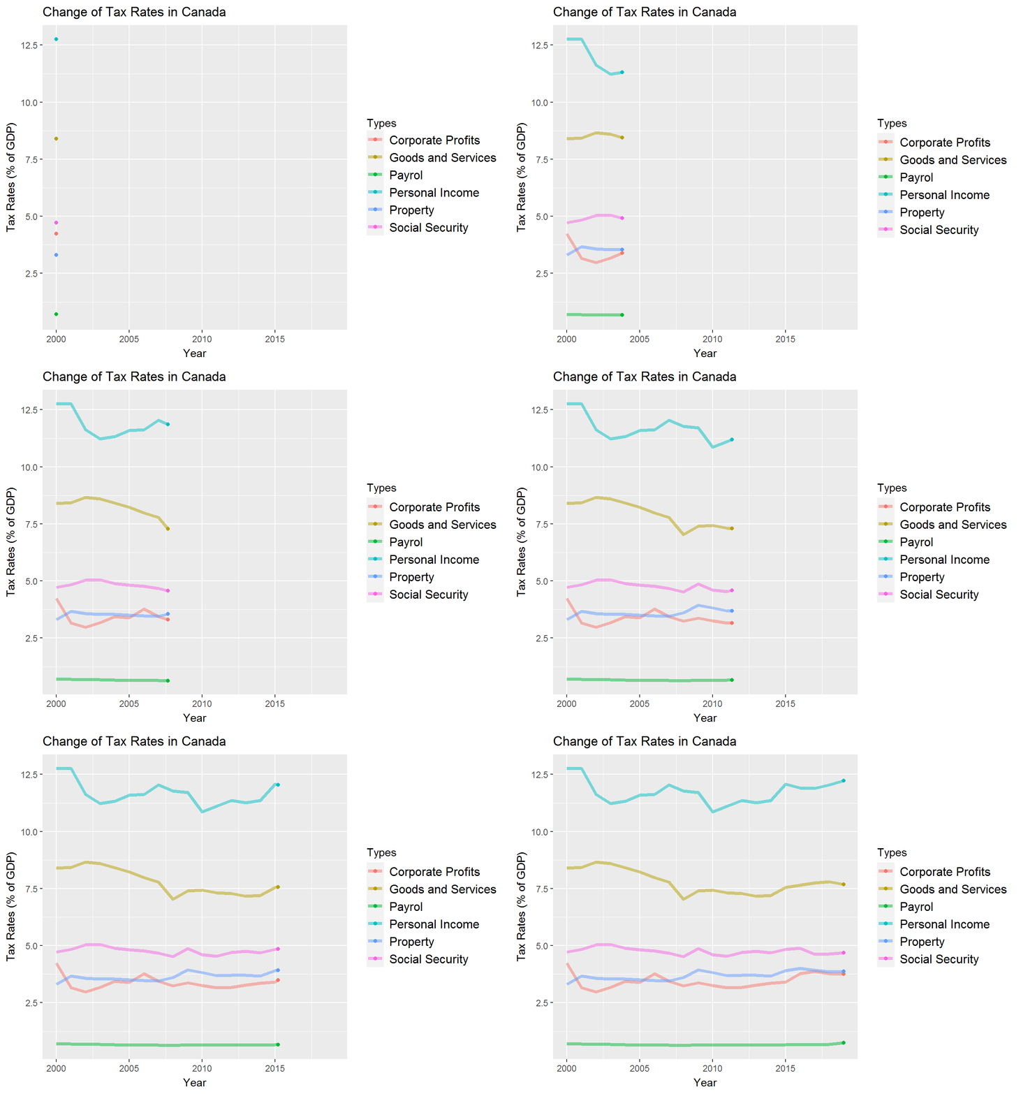
Changes in different tax rates as a % of GDP from the years 2000 to 2019.
library(readxl)                                 #out.width used as plot was going out of page
OECDTaxREVCAD <- read_excel("D:/Website/Data/OECDTaxREV.xlsx",
                         sheet = "OECDTaxREVCAD")
library("gganimate")
library("ggthemes")
library("dplyr")
library("png")
library("gifski")

Line_graph <- OECDTaxREVCAD %>%
            ggplot(aes(x=Year, y=Tax_perc_GDP, color = Types))+
            geom_point(aes(x=Year, y=Tax_perc_GDP))+
            labs(title = "Change of Tax Rates in Canada",
            y="Tax Rates (% of GDP)")+
            geom_line(size=1.5, alpha = 0.5)+
            theme(axis.title = element_text(),
        text = element_text(family = "Rubik"),
        legend.text = element_text(size=12))

Line_graph + transition_reveal(Year) #Animation 
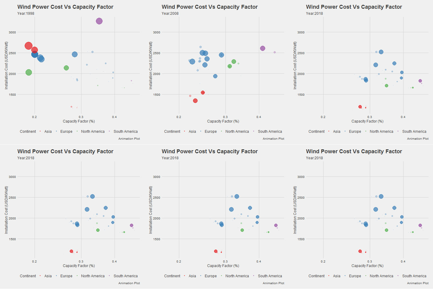
Below I present an animation plot of the cost of wind power vs capacity factor varying across time using ggplot 2 package.
Loading required packages and data:
library(readxl)
WindCostVsLCOE <- read_excel("D:/Website/Data/Wind_CapacityVsLCOE.xlsx",
                                   sheet = "OnShoreWind (2)")
library("gganimate")
library("ggthemes")
library("dplyr")
library("png")
library("gifski")
WindCost <- WindCostVsLCOE %>%
ggplot(aes(x = Capacityfactor, y=IntalledCost, size = LCOE, #size of bubbles
color=Continent)) +
geom_point(alpha = 0.7, stroke =0) +
theme_fivethirtyeight()+
scale_size(range = c(2, 12), guide = "none") +
scale_x_log10() +
labs(title = "Wind Power Cost Vs Capacity Factor",
x = "Capacity Factor (%)", y = "Installation Cost (USD/KWatt)",
caption = "Animation Plot")+
theme(axis.title = element_text(),
text = element_text(family = "Rubik"),
legend.text = element_text(size=12))+
scale_color_brewer(palette="Set1")+
transition_time(as.integer(WindCostVsLCOE$Year))+ #as.integer to remove decimal from Year
labs(subtitle = "Year:{frame_time}")+
shadow_wake(wake_length = 0.1) #to add wave to plotTo generate the animation we can use the following code but the file size will be too large and rendering time will increase the load time of the website.
#animate(WindCost, renderer = gifski_renderer(), duration = 30, end_pause = 60)To avoid this I save the animation as a gif, decrease the size of gif using “gifsicle” package and load it separately.
#anim_save("wind_Cost.gif")
#brew install gifsicle
#gifsicle wind_Cost.gif --optimize -O3 --colors 16 --resize 350x350  -o wind_CostF.gif
Loading the animation:

For all economies, the Levelized Cost of Electricity (LCOE) from wind power decreased and Capacity Factor increased over time. However, for Asian Economies, the capacity factor of Wind power is among the lowest even in 2018.